What's new for the Microsoft Fluent UI Blazor library 4.8
Before we can all go out and enjoy our well deserved summer break, we are happy to bring you a new version of the Fluent UI Blazor library. In this version, we've added some awesome new features to existing components, fixed quite some issues, made 1 (small) breaking change and worked hard to just make the library better overall.
The list of changes and additions is too long to describe all of them here. The full list can be found on our GitHub releases page or at the What's New page on our demo and documentation site. In this blog the following changes and (new) features will be highlighted:
- Breaking change in
Option<TType>-class - Calendar now offers date range selection
- List components now inherit from
FluentInputBase - Autocomplete can sets its height automatically
- NavMenu now works better in mobile views
- ProfileMenu adds
StartTemplateandEndTemplate - TreeView now supports
ItemsandLazyLoadItemsparameters - Preview packages feed available
Breaking change in Option<TType>-class
The Option<TType>-type is a utility class that can be used to define list of options that are presented in a FluentSelect or any of the other list components. We have examples of showing how this work available on the demo site.
Originally, the Text property in this class was of type TType?. We've changed this in this release so that this property is now of type string?, which, we think, makes much more sense. (The Value property of this type remains as-is (TType?).)
If you are using this type, you'll most probably need to make some (small and simple) changes in your code after upgrading to this version.
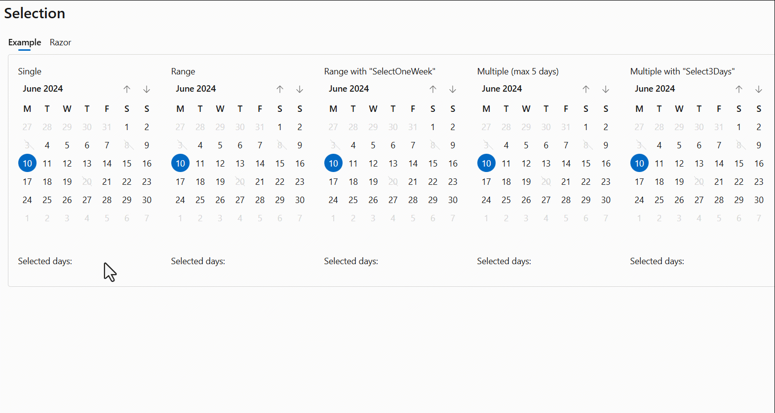
Calendar now offers date range selection
Besides offering more ways of selecting dates in the FluentCalendar component, we have now also added date range selection capabilities.
Initially, this feature will only be available for the FluentCalendar with View=Days.
A new bindable property SelectedDates is added to retrieve the selected dates. We also added a SelectDatesHover method that returns a list of dates to be pre-selected on hover. The dates will be selected when the user clicks on this selection. This allows for enabling options such as selecting an entire week or work-week with a single click.
The @bind-SelectedDates:after command can be used to validate the content of selected dates, block or remove them if necessary, or even display an error message.
Code example
<FluentCalendar @bind-SelectedDates="@SelectedRangeCustomized"
                SelectDatesHover="@SelectOneWeek"
                SelectMode="CalendarSelectMode.Range" />

<FluentCalendar @bind-SelectedDates="@SelectedDaysCustomized"
                SelectDatesHover="@Select3Days"
                SelectMode="CalendarSelectMode.Multiple" />

@code
{
    private ICollection<DateTime> SelectedRangeCustomized = new List<DateTime>();
    private ICollection<DateTime> SelectedDaysCustomized = new List<DateTime>();

    private IEnumerable<DateTime> SelectOneWeek(DateTime date)
    {
        return new[] { date.StartOfWeek(), date.StartOfWeek().AddDays(6) };
    }

    private IEnumerable<DateTime> Select3Days(DateTime date)
    {
        return Enumerable.Range(0, 3).Select(i => date.AddDays(i));
    }
}
List components now inherit from FluentInputBase
The list components (FluentAutoComplete, FluentCombobox, FluentListbox and FluentSelect) now inherit from FluentInputBase instead of FluentComponentBase.
This allows for the components to partake in form validation and be marked as invalid.

Note: Marking a
FluentAutocompletecomponent as invalid does not work yet.
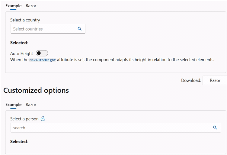
Autocomplete can set its height automatically
We adding a new MaxAutoHeight parameter to the Autocomplete component. By using this, you can make the component use an auto-height with a maximum size. If a value is not set (or is null), the current behavior (a single line with horizontal scroll capabillity) is used.
<FluentAutocomplete MaxAutoHeight="60px" ... />
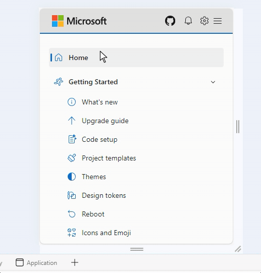
NavMenu now works better in mobile views
Both the demo site and template created sites now work the same when a NavMenu is shown in a mobile view. Clicking on either a NavGroup's expand/collapse button or the group itself will just expand/collapse that group (when no href set on the group). Clicking a NavLink wich has an href set, will now navigate to that link and subsequently close the menu.
With these change we get consistent behavior in both demo and template sites
Before:
After:

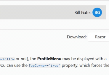
ProfileMenu adds StartTemplate and EndTemplate
We've added StartTemplate and EndTemplate parameters to make it possible to have custom code before/after the avatar inside the button. The CSS variable --fluent-profile-menu-hover can be used to defined the hover background color (overridable).
<FluentProfileMenu Initials="BG" Style="--fluent-profile-menu-hover: var(--neutral-stroke-focus); padding: 4px;">
    <StartTemplate>
        Bill Gates
    </StartTemplate>
   ...
</FluentProfileMenu>
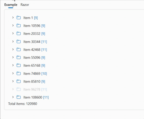
TreeView now supports Items and LazyLoadItems parameters
Over time, we've received a number or requests for a TreeView component which would be able to display a large number of items. This capability is now added to the TreeView:
-
Add an
Itemsparameter to bind a list of nodes and child nodes. Elements in the list need to implementITreeViewItem. The includedTreeViewItemclass already implements this interface. -
Add a
LazyLoadItemsattribute to render HTML only when nodes are expanded. -
Add an
ItemTemplateto allow complete customization of each element. -
Add the bindable
SelectedItemproperty to manage the selectedITreeViewItem. -
Add the
OnExpandedAsyncmethod to enable dynamic loading of sub-items.
Example
For example, some code to display an "unlimited" tree view.
<FluentTreeView Items="@Items" @bind-SelectedItem="@SelectedItem" LazyLoadItems="true">
    <ItemTemplate>
        @context.Text
        <span style="color: var(--accent-fill-rest); margin: 0 4px;">
            @(context.Items == null ? "" : $"[{context.Items.Count()}]")
        </span>
    </ItemTemplate>
</FluentTreeView>
Which will be displayed as this:
Preview packages feed
By popular demand, we have re-created a preview packages feed. See https://dev.azure.com/dnceng/public/_artifacts/feed/dotnet8/NuGet/Microsoft.FluentUI.AspNetCore.Components/overview for details on how to connect your CLI or Visual Studio environments to this feed.
Note: As the preview packages are being created directly from the development branch in the repository, they will not always be stable.
As can be seen from the feed address, our packages are now being created in the .NET Core Engineering (dnceng) environment. A huge step forward for security, stability and longevity of the library!
Much, much more
As said in the beginning of this blog, the items discussed here are only a small part of the large number of changes made in this release. Please visit the What's New page on the demo and documentation site or the GitHub releases page for a complete overview.
Contributors
A very special thanks goes out to these new contributors:
@msb-incom, @ApacheTech, @StevenTCramer, @MarvinKlein1508, @chris-gander, @adospace and @ksbecker
And also a warm 'thank you' to everyone else that contributed.
Join the discussion
We have a new channel for 'near real-time' communication on the official .NET Discord server. Come join us at #fluentui-blazor @ DotNetEvolution. This means we will no longer be using (or monitoring) the #blazor channel on the FAST Discord server.
NuGet
The packages will be released on NuGet in the coming days.
Comments
Comments are closed