What's new for the Microsoft Fluent UI Blazor library 4.6
This Easter you can hunt for new components and updated features instead of eggs. We are happy to present you version 4.6 of the library. In short, the additions:
- PullToRefresh component
- ProfileMenu component
- Global key capture functionality
- Wizard and edit form enhancement
As always, the complete set of changes can be found on the What's new? page on our demo and documentation site.
PullToRefresh
The new FluentPullToRefresh component is an interaction element commonly used in web and mobile applications. The touch gesture initiates an event callback that you subscribe to and implement to retrieve or refresh the data that is displayed inside the component.
The user initiates the gesture by sliding a finger down from the top of the component (or up from the bottom, depending on the setting of the Direction parameter). . 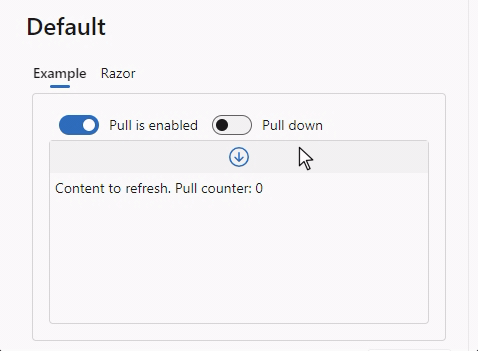
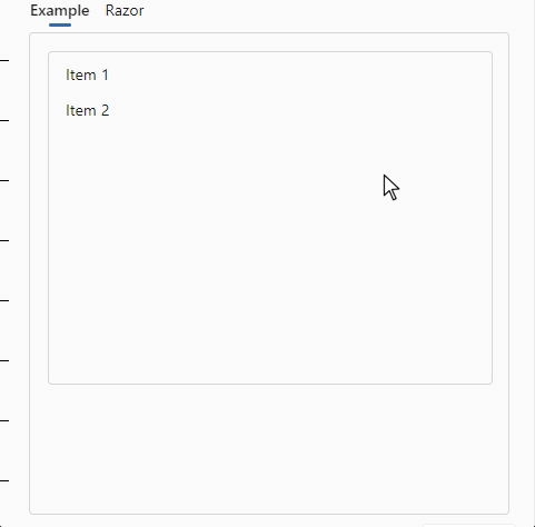
As can be seen from the image, icons are being used to give the user tips on the status of the pull action. These are all templated parameters that can be configured by the developer. In the image below, the icons have been replaced by text and are only shown once a pull action has been initiated.
The source code for this example:
<FluentPullToRefresh Direction="@PullDirection.Down"
                     OnRefreshAsync="OnRefreshAsync"
                     ShowStaticTip="false"
                     Style="height: 400px; width: 400px; ">
    <PullingTemplate>Pull to refresh</PullingTemplate>
    <ReleaseTemplate>Release to update</ReleaseTemplate>
    <CompletedTemplate>Update completed</CompletedTemplate>
    <ChildContent>
        <FluentListbox Height="300px" Items="@Enumerable.Range(1, ItemsCount).Select(i => $"Item {i}")" />
    </ChildContent>
</FluentPullToRefresh>


@code {
    int RefreshCount = 0;
    int ItemsCount = 2;

    public async Task<bool> OnRefreshAsync()
    {
        RefreshCount++;
        DemoLogger.WriteLine($"Pull down refresh count {RefreshCount}");
        await Task.Delay(1000);
        ItemsCount += 3;
        return true;
    }
}
Normally this functionality is used on touch screen devices, like a mobile phone. To enable the functionality on (most) desktop browsers on non-touch screen devices, an emulation script is included and automatically loaded by the component. The interaction is then initiated by a mouse click and drag. You can disable this emulation with the EmulateTouch parameter.
The OnRefreshAsync method is called when the user releases the pull tip at the correct moment (once a configurable distance has been covered). You can have the method return true to indicate there is more data to be fetched. If it returns false a “No more data available” tip can be displayed (which can be configured with the NoDataTemplate parameter).
Profile Menu
The FluentProfileMenu is a component implementing functionality commonly found in the top-right corner of a page or site. It provides options related to the user's account. Within this menu, users can access features such as viewing their account details, adjusting settings, and logging out. It serves as a convenient hub for managing account-related actions.
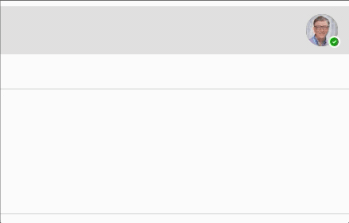
The exact content can be tweaked by using the components' parameters:
<FluentProfileMenu  Image="@DataSource.SamplePicture"
                    Status="@PresenceStatus.Available"
                    HeaderLabel="Microsoft"
                    Initials="BG"
                    FullName="Bill Gates"
                    EMail="bill.gates@microsoft.com"
                    Style="min-width: 330px;" />
Global key capture
It is now possible to capture keystrokes globally on a page or component.
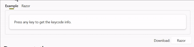
Examples of how this can be used are available at the documentation page.
Wizard and EditForm enhancement
We’ve added a new FluentEditForm component which inherits the standard EditForm component, but allows for correctly handling form validations within our Fluent components.
Throughout your project, you can use FluentEditForm instead of EditForm. For now we have updated the Wizard component to use this. We’ll be updating other components to handle forms in a similar way moving forward.
Example: 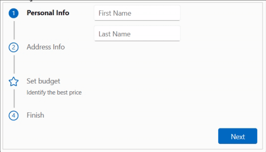
New and updated icons
We updated to the Fluent UI System Icons release 1.1.233
What's new (Name / Size(s) / Variant(s))
- Classification / 32 / Filled & Regular
- Document Target / 20, 24, 32 / Filled & Regular
- Emoji Meme / 16, 20, 24 / Filled & Regular
- Hand Point / 16, 20, 24, 28, 32, 48 / Filled & Regular
- Mail Read Briefcase / 48 / Filled & Regular
- People Subtract / 20, 24, 32 / Filled & Regular
- Person Alert Off / 16, 20, 24, 32 / Filled & Regular
- Shopping Bag Add / 16 / Filled & Regular
- Spatula Spoon / 16, 20, 24, 28, 32, 48 / Filled & Regular
- Accessibility Error / 20, 24 / Filled & Regular
- Accessibility Question Mark / 20, 24 / Filled & Regular
- Arrow Down Exclamation / 24 / Filled & Regular
- Arrow Sort Up Lines / 16, 20, 24 / Filled & Regular
- Arrow Up Exclamation / 16, 20, 24 / Filled & Regular
- Bench / 20, 24 / Filled & Regular
- Building Lighthouse / 28 / Filled & Regular
- Clock Bill / 16, 20, 24, 32 / Filled & Regular
- Data Usage Settings / 16, 24 / Filled & Regular
- Data Usage / 16 / Filled & Regular
- Edit Person / 20, 24 / Filled & Regular
- Highway / 20, 24 / Filled & Regular
- Laptop Person / 20, 24, 48 / Filled & Regular
- Location Ripple / 16, 20, 24 / Filled & Regular
- Mail Arrow Double Back / 32 / Filled & Regular
- Mail Briefcase / 48 / Filled & Regular
- People Add / 32 / Filled & Regular
- Person Alert / 32 / Filled & Regular
- Road / 20, 24 / Filled & Regular
- Save / 32 / Filled & Regular
- Tab Desktop Multiple Sparkle / 16, 20, 24 / Filled & Regular
- Tab Desktop Multiple / 24 / Filled & Regular
- Vehicle Tractor / 20, 24 / Filled & Regular
What's updated (Name / Size(s) / Variant(s))
- Classification / 20, 24 / Filled & Regular
- Emoji Add / 20 / Filled & Regular
- Emoji Edit / 20 / Filled & Regular
- Emoji Sparkle / 20 / Filled & Regular
- Emoji / 20 / Filled & Regular
- Accessibility Checkmark / 24 / Filled & Regular
- Arrow Down Exclamation / 16, 20 / Filled & Regular
- Arrow Sort Down Lines / 16, 20, 24 / Filled & Regular
- Building Lighthouse / 48 / Filled & Regular
- Calendar Video / 20, 24, 28 / Filled & Regular
- Options / 16, 28, 32 / Filled & Regular
- Person Alert / 16, 20, 24 / Filled & Regular
- Tab Desktop Multiple Bottom / 24 / Filled
Other changes
FluentAccordion: theExpandedparameter of the Accordion element now supports 2-way binding (@bind-Expanded).FluentAppBarItem: AddedOnClickevent to AppBarItems.FluentButton: Fixed padding on the 'loading spinner' in case of no text being displayed.FluentPaginator: Added the ability to disable pagination buttons withDisabledparameter.FluentPersona: Can handle 'empty' names (Name="") now and added anOnClickevent.
Comments
Comments are closed