What's new for the Microsoft Fluent UI Blazor libraries 3.6 and 4.5
We have new releases! Version 3.6 for .NET 6 and 7 and version 4.6 for .NET 8 are here. Happy to report that a huge number of issues has been fixed for both versions (both by us and by contributors). Let's dive into the details...
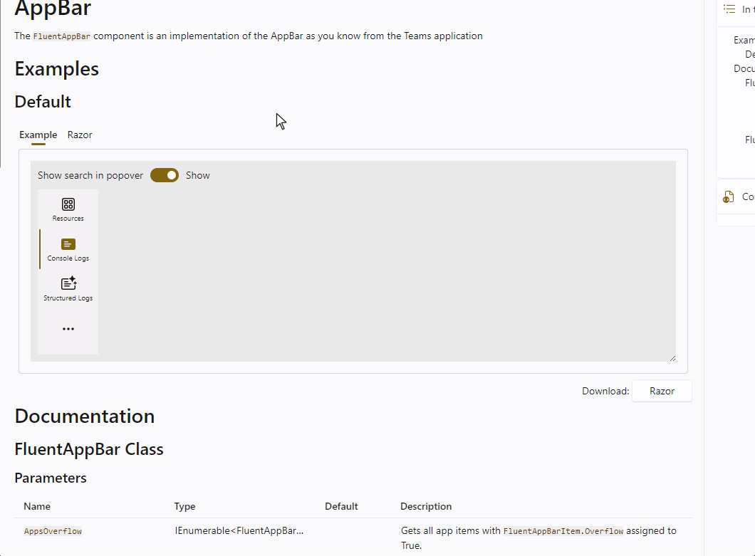
New: AppBar component (4.5 only)
Based on the work done by the .NET Aspire team (this library powers the .NET Aspire Dashboard!) a new FluentAppBar component has been added. The AppBar shows AppBarItems in a vertical fashion just like the one you'll find in Teams and the (new) Outlook. It automatically shows '...' in the bottom when the number of applications is larger then the available vertical space. You can control whether that popover shows a search bar or not.
Changes, updates and additions that apply to both versions
We are not listing all the changes in this post but just the most prominent ones. To see the full list changes, we have GitHub release pages:
Demo site: Search for components
With almost 70 components in the library, it can sometimes get a bit hard to find the right documentation and example page. To help you navigate the site, we've added a component search function to the header (in desktop view only).

Grid: Spacing and margins
The FluentGrid became wider when the value for the Spacing parameter was increased. This has been fixed.
Before: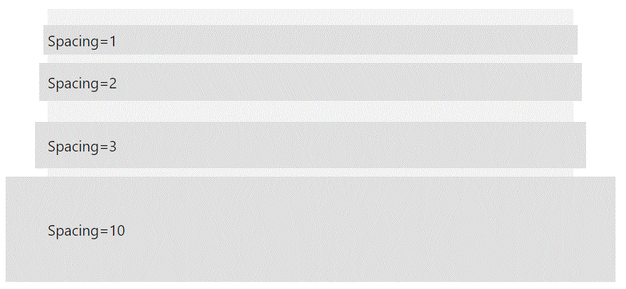
After: 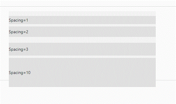
Menu and Popover: Add Threshold parameters
Both the Menu and Popover component internally use the AnchoredRegion component to 'attach' their output to antoher element. The AnchoredRegion component exposes the VerticalThershold and HorizontalThreshold parameters to set the minimum space needed to render the attachment in the preferred location. This allows to create an automatic 'reflow' in case there is not enough space available. The video below shows a Popover which is displayed below a button. It automatically switches to be shown above the button if it doesn't fit anymore when resizing the window. In the 'before' situation, it would remain in the smae location and would get cutoff on resizing.
With this change it is now possible to set the thresholds for both the Menu and Popover components. See the video below for the effect.
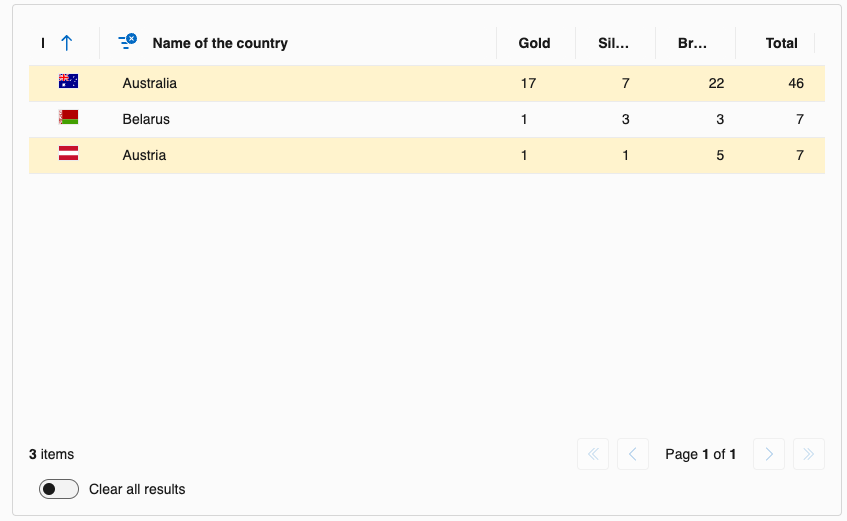
DataGrid: Add a Filtered property and visual indicator to PropertyColumn
When using multiple filters in a DataGrid, it was not easy to see if a filter was applied for a specific column. A FilterDismiss icon will now be shown when a filter is being applied on a column.
MenuButton: Added overlay and more appearance options
- A
FluentOverlayhas been added so clicking outside the menu closes it - A
ButtonAppearanceparameter has been added to make changing the button appearance possible
Example have been added to the demo site to show this. Example of the overlay being used: 
Card: Add a MinimalStyle parameter
By default the FluentCard component is a visual container and design system provider. Cards are snapshots of content that are typically used in a group to present collections of related information. Thus, by design, the FluentCard component includes all the styles required for a good representation of the other components included in it. This adds a large number of styles such as justify-content; align-items; gap; width; and over 80 other CSS variables. The amount of code generated can become quite important, especially if you use this component a lot of times, for example in a large list.
To prevent this, you can now use the MinimalStyle parameter. This will remove all the default styles from the FluentCard component. and apply a currated set of styles throug an isolated CSS. This will allow you to use the FluentCard component as a simple container with only the styles needed to draw the box-shadow (and some other required style rules).
Example usage
<FluentCard MinimalStyle="true">
    <p>Just some content in a card (with a button that does not do anything).</p>

    <FluentButton Appearance="Appearance.Accent">Hello</FluentButton>
    <p>No Width or Height has been specified.</p>
</FluentCard>
Code generated
<div class="fluent-card-minimal-style">
  <p>Just some content in a card (with a button that does not do anything).</p>
  <fluent-button type="button" appearance="accent" class="accent">Hello</fluent-button>
  <p>No Width or Height has been specified.</p>
</div>
Default FluentCard code generated
Tooltip: Additional behavior added
[FluentTooltip] Add the HideTooltipOnCursorLeave property
We have added a HideTooltipOnCursorLeave parameter to the FluentTooltip component. You can now choose to use the default behavior:
Or use a new behavior:
The behavior can also be set through the global configuration:
builder.Services.AddFluentUIComponents(configuration =>
{
    configuration.HideTooltipOnCursorLeave = true;
});
Icons: updated to Fluent UI System Icons v1.1.230
What's new (Name / Size(s) / Variant(s))
- Checkmark Circle Warning / 16, 20, 24 / Filled & Regular
- Cloud Arrow Right / 16, 20, 24 / Filled & Regular
- Document Arrow Down / 24 / Filled & Regular
- Document Signature / 16, 20, 24, 28, 32, 48 / Filled & Regular
- Home Garage / 20, 24 / Filled & Regular
- Image Split / 20, 24 / Filled & Regular
- Laptop / 48 / Filled & Regular
- Line Flow Diagonal Up Right / 16, 20, 24, 32 / Filled & Regular
- Mail Arrow Clockwise / 16, 20, 24 / Filled & Regular
- Person Passkey / 16, 20, 24, 28, 32, 48 / Filled & Regular
- Person Prohibited / 32 / Filled & Regular
- Person Ribbon / 24 / Filled & Regular
- Plant Cattail / 20, 24 / Filled & Regular
- Storage / 16, 28, 32, 48 / Filled & Regular
- Video Clip Wand / 16, 20, 24 / Filled & Regular
- Window Fingerprint / 16, 20, 24, 28, 32, 48 / Filled & Regular
What's updated (Name / Size(s) / Variant(s))
- Video Add / 20, 24 / Filled & Regular
No release notes were made available for the versions between 1.1.226 and this one
Special thanks to @StevenRasmussen, @lus, @bruno-garcia, @CV-souryu, @Hona, @digitaldirk, @c0g1t8, @thebarrettlo, @weskroesbergen, @joriverm and @NickHirras for their contributions!
Comments
Comments are closed