What's new for the Microsoft Fluent UI Blazor components 4.4
We have a great set of new components, fixes and updates available for you in this release. As always, first the highlights and then the extended descriptions.
- New Sortable List component
- New KeyCode component
- New (experimental) MultiSplitter component
- Template updates
- Documentation and demo site updates
- Miscellaneous fixes and changes
New Sortable List component
An implementation of the SortableJS library for Blazor Fluent UI. It allows for reordering elements within a list (or between lists) using drag and drop. It is based based on Burke Holland's article and code. (re-used with permission).
The demo site has all the details on how to use the component in your own projects (we do not include the SortableJS script in the library) and what parameters can be used for configuration. We made some changes in comparison to the original JS properties to give it more of a Blazor-feel.
The component does not have any default implementations for handling update and/or remove events. You will need to add those yourself. Examples of this are provided, of course. If you don't handle any events, no sort or move will happen as Blazor needs to make the changes to the underlying data structures so it can re-render the list.
Here is an example of how to reorder your list when the OnUpdate is fired...
private void SortList(FluentSortableListEventArgs indices)
{
     if (args is null || args.OldIndex == args.NewIndex)
     {
         return;
     }

     var oldIndex = args.OldIndex;
     var newIndex = args.NewIndex;

     var items = this.items;
     var itemToMove = items[oldIndex];
     items.RemoveAt(oldIndex);

     if (newIndex < items.Count)
     {
         items.Insert(newIndex, itemToMove);
     }
     else
     {
         items.Add(itemToMove);
     }
}
And an example of what it looks like in action:

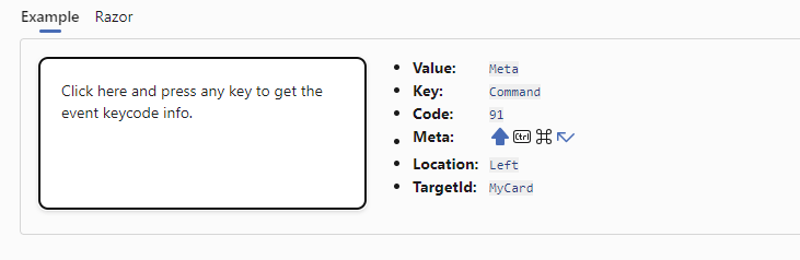
New KeyCode component
In some circumstances, Blazor does not retrieve all the KeyDown information it receives from JavaScript. FluentKeyCode is a small helper component that retrieves this data, in a similar way to the JavaScript KeyCode library.
The FluentKeyCode component extends the functionality of OnKeyDown event by adding the KeyCode property when it is raised. The component is attached to the compoent it needs to handle the OnKeyDown event for by means of the Anchor parameter. A typical usage example looks like this:
<FluentKeyCode Anchor="MyCard" OnKeyDown="@KeyDownHandler" />
There are parameters to ignore, and included specific (sets of) key codes. It is also possible to stop propagation and/or prevent the default action of the current event.
The demo site has an example of how the component can be used:
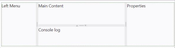
New (experimental) Multi Splitter component
The MultiSplitter splits a page into multiple sections and allows the user to control the page layout.
You can include as many panes as you like in a container. By default, panes are resizable, but the Resizable parameter can be used to block this functionality. The initial Size is in percent or pixels and has a Min and Max value. A Pane can be fully collapsed by setting the Collapsible parameter to True.
DataGrid component updates
We've added adds Loading and LoadingContent parameters to the FluentDataGrid. By default, when Loading is set to true, the loading content will be a progress ring with the text 'Loading...' shown besides it. You can replace that with your own content by means of the LoadingContent parameter.
To change the state of the Loading parameter at a later stage, use the SetLoadingState(bool loading) method on the FluentDataGrid. To be able to call this method from your code, you need to add a @ref to your grid
The loading content is rendered in a FluentDataGridRow with one FluentDataGridCell inside of it. The row height will be set to 100%. If no height is set for the grid this will be a normal row height. It a height is set for the grid, the row will take up all remaining height. In the example below, no height was specified for the grid.
In this example te height of the grid is set to 100% of its container. Loading content takes full height (minus header height)
We applied this same sizing logic to the EmptyContent rendering. As this is (small) change from how this was done before, please check your app after upgrading to this version!
Lists components updates
The list components (AutoComplete, Checkbox, Listbox and Select) have been modified so it does not matter if the options are specified through the Items parameter or from manually specified FluentOptions. In a single select situation, we will now always find and handle the selected option.
For specifying the items for a list, the Option<T> class was already available. Within an option you can specify an icon which is then shown in front of the option in the list. We found that in earlier code this only worked when T was a string. This has now been fixed. 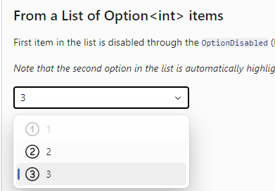
The AutoComplete component has been received an accessibility upgrade. You can now use arrow keys to navigate through list items and use enter to select an item. Overall the component now works much better with screen reader software.
Updates to Fluent UI System Icons
Since our last update, 2 new versions of the Fluent UI System Icons collection have been released. With this version we've updated our icon package to get in all those additions and changes. As the list of updates (66 icons) and additions (24 new icons) is quite long, we refer you to the What's New page on the demo site for a complete overview.
Templates updates
We've updated the templates to incorporate the latest fixes we made to the components. We also fixed an issue that showed up when external providers are being used for authentication.
You can install the templates for CLI and Visual Studio so you can start new applications with everything needed for Fluent already set up.
Documentation and demo site updates
Besides updating existing and adding some new examples, we did not change much in the demo and documentation site. With our last update, the hamburger menu was not positioned correctly anymore when viewing the site on a mobile device. This has been fixed. Also, the version of the library displayed in footer has been tweaked a bit so it now shows the Git hash associated with the commit the site was built from in truncated form.
Miscellaneous fixes and changes
-FluentIcon - If the size of your customized icon (viewbox) is not one of the standard IconSize sizes, you can now use an IconSize.Custom size.
The rest of fixes and changes for this release is (again) quite a long list. We refer you to the What's New page on the docs site for a complete overview (including links to the GitHub issues and pull requests).
Comments
Comments are closed