What's new for the Microsoft Fluent UI Blazor components version 4.2.0
Just in time for the X-mas holiday/year-end break, we are happy to deliver you the 4.2 version of the Fluent UI Blazor library with shiny new toys to play and tinker with. In the box you'll find a new Fluent Theme component, a Tree-state checkbox and a dash of responsiveness for the templates, to name a few.
As always, first the bullet points followed by the extended descriptions. Some of these changes were introduced with 4.1 but as I didn't do a blog post then, I'll include them here.
- New:
FluentDesignTheme- An easy-to-use component to set a theme and accent color. - New: FluentValidationMessage and Required indicator for input components
- Enhanced: NavMenu
- Enhanced: InputFile
- Enhanced: List components
- Enhanced: DatePicker
- Enhanced: Grid
- Enhanced: Checkbox
- Enhanced: Splitter
- Enhanced: Paginator
- Updated Templates: responsive NavMenu and other imporvements
- Updated Fluent UI System Icons to version 1.1.224
FluentDesignTheme
The FluentDesignTheme component allows you to easily manage the main/accent color and mode (dark/light) of your entire application. With this we also create some web components which can be used to prevent a 'flash of brightness/darkness' when loading an application and to already set a theme and color befor Blazor has actually started.
See the full documentation in the documentation site at the DesignTheme page. To see a video expling how to work with this new component, go to YouTube: https://youtu.be/EyGKOPiT4z0?si=L619h97ASh8TgtMy
Settings a user specifies with the FluentDesignTheme can be persisted in local storage and be re-applied when an application restarts.
The image below shows the effect of applying the component.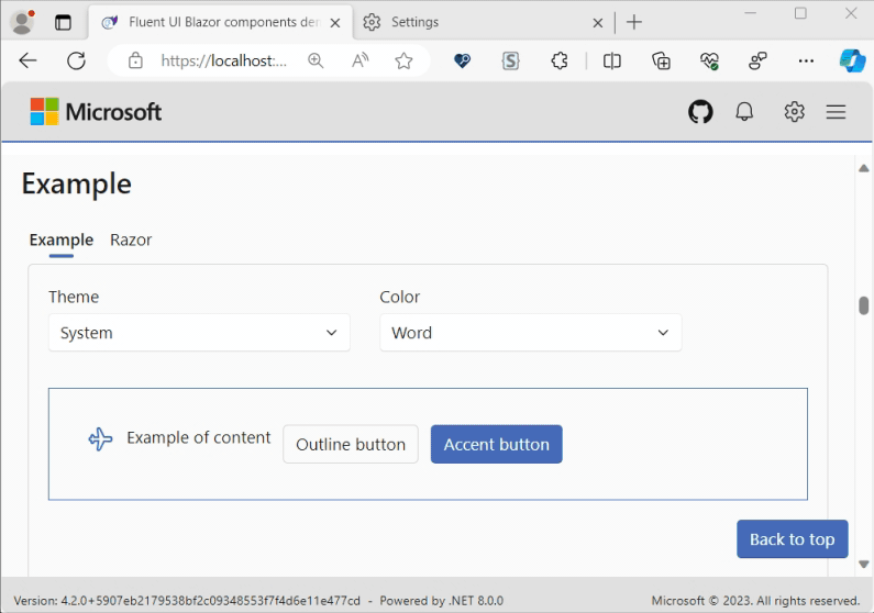
We also changed the demo site to use this component for color and theme selection.
If you'd like to customize design details of your application at a much more fine-grained level, please keep using the DesignTokens just as before.
p.s. in the image above you can see the new OptionTemplate parameter of the listbox in action. More details on that below.
FluentValidationMessage and Required indicator
We've added a FluentValiationMessage component (which is a copy from the standard ValidationMessage) to be able to show validation errors directly below a form field. As this is a copy, all the same rules and parameters from the standard component apply to this component as well. Besides that, we also added a Required indicator which will be shown next to a field label. By default this will use a red star. But this can be changed by changing the RequiredLabel parameter of the LibraryConfiguration in the AddFluentComponents extension method like this:
builder.Services.AddFluentUIComponents(options-> options.RequiredLabel = "{your format}");
An example of a form with these new options applied:

NavMenu
The NavMenu components have been enhanced to make it possible for the menu to expand when it is in its collapsed state and navigation item's icon is clicked. 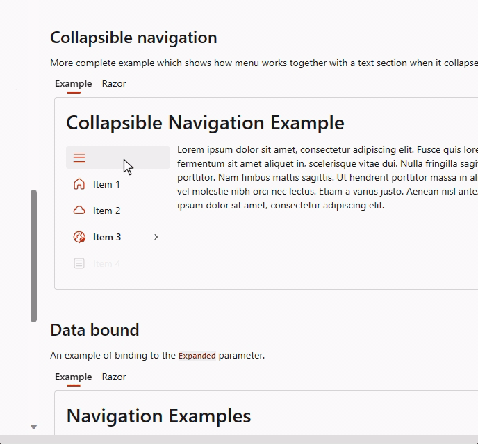
The NavMenu components now support tooltips for both groups and items. Groups already had the Title parameter being used for this, this can now be overriden with the Tooltip parameter
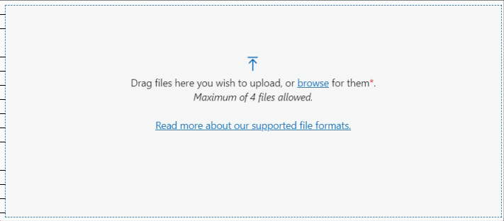
InputFile
FluentInputFile now supports ProgressTemplate and ProgressPercent (bindable) parameters The ProgressTemplate can be used by the component to display a ProgressBar or any other "loading" message. The ProgressPercent is bindable and can, for example, be reset at the end of an upload operation.
List components
With the new OptionTemplate parameter, you can supply custom content for each option in the list components (listbox, select, combobox and autocomplete). As already mentioned, we use this internally to give a visual representation of the accent color in the DesignTheme component. Another example is available on the documentation pages for the different list components. For example the select component: 
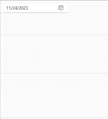
DatePicker
The FluentDatePicker was missing a couple of important views to make it a fully fledged date component. This is now corrected with the addition of month and year views.
Grid
Two new parameter have been added to the FluentGrid:
HiddenWhen
With this you can specify when a grid item needs to be hidden. Because this parameter uses a flagable enumeration, multiple values can be combined by using the '|' operator. See below for the table with all possible options and breakpointsOnBreakpointEnter
ThisEventCallbackallows you to hook into the event that triggers when a matchMedia Query is verified.
<FluentGrid>
    <FluentGridItem xs="12"> ... </FluentGridItem>
    <FluentGridItem xs="12" sm="6" HiddenWhen="GridItemHidden.SmAndDown"> ... </FluentGridItem>
    <FluentGridItem xs="12" sm="6"> ... </FluentGridItem>
</FluentGrid>
A video showing how easy it is to buid a responsive layout with this component is on YouTube at https://youtu.be/p6xZX2-4hn8
The table below gives an overview of what is visible when.

Checkbox
The FluentCheckbox now supports three-state behavior.
-
The new
ThreeStateparameter defines whether the user can switch from one state to another. -
The new
CheckStateparameter will representUnchecked,CheckedorIndeterminatevalue.
You can even specify in what order the different states will be handeled by means of the ThreeStateOrderUncheckToIntermediate parameter. See the images below for a representation of this.
- ThreeStateOrderUncheckToIntermediate = False:
[ ] -> [x] -> [-]
- ThreeStateOrderUncheckToIntermediate = True:
[ ] -> [-] -> [x]


Splitter
We've added Panel1MinSize, Panel2MinSize and BarSize parameters to the FluentSplitter component to specify the minimum size panels can be sized down to and to specify the width of the resize bar 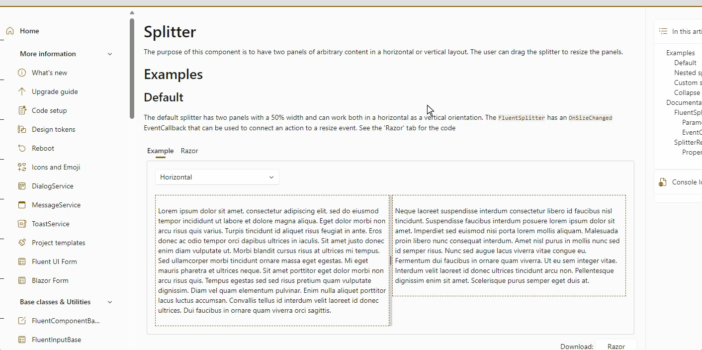
It is now possible to completely collapsing panel 2 (right/bottom) and hook into those events by the OnCollapsed, OnExpanded and OnResized EventCallbacks
Resizing panels now always uses proportional values.
Paginator
To better support localization and customization, we added a PaginationTextTemplate parameter to the FluentPaginator component. By using the CurrentPageIndex and LastPageIndex (both 0-based!) from the State, you can craft your own text to show beneath a DataGrid. An example as implemented in the demo site:
 Asopposed to the regular text:

Templates
- A lot of fixes have been implemented to make sure pages and layouts get the right
@rendermodeattribute set and NavMenu options based interactivity choices made during the creation of an application. In summary:
| Rendermode / Interactivity | NavMenu @rendermode | NavMenu Collapsible | WC script in body |
|---|---|---|---|
| SSR / not applicable | ? | ? | ? |
| Server / Global | ? | ? | ? |
| Server / Per Page | ? | ? | ? |
| WebAssembly / Global* | ? | ? | ? |
| WebAssembly / Per Page* | ? | ? | ? |
| Auto / Global* | ? | ? | ? |
| Auto / Per Page* | ? | ? | ? |
*NavMenu moved to Client project
- The templates now use a responsive approach with the NavMenu. The template's CSS now with a breakpoint where the menu is rendered above the content when the screen size is lower then 600 pixles wide and the menu is rendered to the side when the screeen size is above 600 pixels. See the image below for an impression
Fluent UI System Icons
Update to version 1.1.224
What's new (Name / Size(s) / Variant(s))
- Arrow Clockwise Dashes / 16, 32 / Filled & Regular
- Building Swap / 16, 20, 24, 32, 48 / Filled & Regular
- Certificate / 32 / Filled & Regular
- Clipboard Brush / 16, 20, 24, 28, 32 / Filled & Regular
- Cloud Beaker / 16, 20, 24, 28, 32, 48 / Filled & Regular
- Cloud Cube / 16, 20, 24, 28, 32, 48 / Filled & Regular
- Contract Up Right / 16, 20, 24, 28, 32, 48 / Filled & Regular
- Document Data Lock / 16, 20, 24, 32 / Filled & Regular
- Glance Horizontal Sparkles / 20 / Filled & Regular
- Layout Cell Four Focus Bottom Left / 16, 20, 24 / Filled
- Layout Cell Four Focus Bottom Right / 16, 20, 24 / Filled
- Layout Cell Four Focus Top Left / 16, 20, 24 / Filled
- Layout Cell Four Focus Top Right / 16, 20, 24 / Filled
- Layout Cell Four / 16, 20, 24 / Filled & Regular
- Layout Column Four Focus Center Left / 16, 20, 24 / Filled
- Layout Column Four Focus Center Right / 16, 20, 24 / Filled
- Layout Column Four Focus Left / 16, 20, 24 / Filled
- Layout Column Four Focus Right / 16, 20, 24 / Filled
- Layout Column Four / 16, 20, 24 / Filled & Regular
- Layout Column One Third Left / 16, 20, 24 / Filled & Regular
- Layout Column One Third Right Hint / 16, 20, 24 / Filled & Regular
- Layout Column One Third Right / 16, 20, 24 / Filled & Regular
- Layout Column Three Focus Center / 16, 20, 24 / Filled
- Layout Column Three Focus Left / 16, 20, 24 / Filled
- Layout Column Three Focus Right / 16, 20, 24 / Filled
- Layout Column Three / 16, 20, 24 / Filled & Regular
- Layout Column Two Focus Left / 16, 20, 24 / Filled
- Layout Column Two Focus Right / 16, 20, 24 / Filled
- Layout Column Two Split Left Focus Bottom Left / 16, 20, 24 / Filled
- Layout Column Two Split Left Focus Right / 16, 20, 24 / Filled
- Layout Column Two Split Left Focus Top Left / 16, 20, 24 / Filled
- Layout Column Two Split Left / 16, 20, 24 / Filled & Regular
- Layout Column Two Split Right Focus Bottom Right / 16, 20, 24 / Filled
- Layout Column Two Split Right Focus Left / 16, 20, 24 / Filled
- Layout Column Two Split Right Focus Top Right / 16, 20, 24 / Filled
- Layout Column Two Split Right / 16, 20, 24 / Filled & Regular
- Layout Column Two / 16, 20, 24 / Filled & Regular
- Layout Row Four Focus Bottom / 16, 20, 24 / Filled
- Layout Row Four Focus Center Bottom / 16, 20, 24 / Filled
- Layout Row Four Focus Center Top / 16, 20, 24 / Filled
- Layout Row Four Focus Top / 16, 20, 24 / Filled
- Layout Row Four / 16, 20, 24 / Filled & Regular
- Layout Row Three Focus Bottom / 16, 20, 24 / Filled
- Layout Row Three Focus Center / 16, 20, 24 / Filled
- Layout Row Three Focus Top / 16, 20, 24 / Filled
- Layout Row Three / 16, 20, 24 / Filled & Regular
- Layout Row Two Focus Bottom / 16, 20, 24 / Filled
- Layout Row Two Focus Top / 16, 20, 24 / Filled
- Layout Row Two Split Bottom Focus Bottom Left / 16, 20, 24 / Filled
- Layout Row Two Split Bottom Focus Bottom Right / 16, 20, 24 / Filled
- Layout Row Two Split Bottom Focus Top / 16, 20, 24 / Filled
- Layout Row Two Split Bottom / 16, 20, 24 / Filled & Regular
- Layout Row Two Split Top Focus Bottom / 16, 20, 24 / Filled
- Layout Row Two Split Top Focus Top Left / 16, 20, 24 / Filled
- Layout Row Two Split Top Focus Top Right / 16, 20, 24 / Filled
- Layout Row Two Split Top / 16, 20, 24 / Filled & Regular
- Layout Row Two / 16, 20, 24 / Filled & Regular
- Location Target Square / 16, 20, 24, 32 / Filled & Regular
- Resize / 16, 28, 32, 48 / Filled & Regular
- Select All Off / 16 / Filled & Regular
- Select All On / 16 / Filled & Regular
- Share Android / 16, 32 / Filled & Regular
- Text Arrow Down Right Column / 16, 20, 24, 28, 32, 48 / Filled & Regular
- Text Effects Sparkle / 20, 24 / Filled & Regular
- Whiteboard Off / 16, 20, 24 / Filled & Regular
- Whiteboard / 16 / Filled & Regular
What's updated (Name / Size(s) / Variant(s))
- Contract Down Left / 28 / Filled & Regular
- Resize / 20, 24 / Filled & Regular
- Select All Off / 20, 24 / Filled & Regular
- Select All On / 20, 24 / Filled & Regular
Miscellaneous
- Fix for checkbox, switch, slider being used in
EditFormnot getting set on first few clicks
Demo and documentation site updates and changes
- Update Fluent UI System Icons to 1.1.224 (overview of what's new/changed on the docs site)
- Demo: Move ErrorBoundary into DemoSection component so page keeps working when only one section fails
- Fix miscellaneous demo errors caused by trimming
- Move CacheStorageAccessor and StaticAssetService to Demo.Shared project as these are specific to the demo site and not the library
CI Builds of the core package
If you want to be on the bleeding edge and follow along with what we are building next, we have a feed available that hosts the packages for the core library which are built on each commit we do to the dev branch. The address of the feed is https://pkgs.dev.azure.com/fluent-blazor/public/_packaging/previews/nuget/v3/index.json
The packages from this feed are not for use in a production environment. The packages come directly from our development branch. It is therefore entirely possible (propable) that issues may arise and cuase problems or instabillaty that may take hours or even days to detect and correct.
Hope this helps!
Comments
Hi Vincent, Awesome news, thank you. We can now set an application wide theme with ease! I tested it on an auto Blazor app and it works as expected. Unfortunately this doesn't seem to be the case for a Blazor Hybrid (Maui) app. It seems after upgrading to 4.2.0 all styling is gone. Are you aware of the issue? Thanks again.
TjitteComments are closed