What's new for the Microsoft Fluent UI Blazor library 4.10
Hi. Hope you had a great summer break. I know I did!
 (Bonus points if you can guess where this picture was taken)
Now that we are back at it, it is time for a new release. We have in total 30 PRs merged for this release (besides some smaller, not PR based, changes) and I won't of course go into all of those here. As always, the complete list is available at the What's New page on our demo and documentation site. If you want to see all the source code changes since the last release, you can go to our GitHub releases page.
In this blog I'll highlight the following changes and (new) features :
- Added .NET 9.0 support
- Several DataGrid enhancements
- Use double click to quickly select a date in the DatePicker
- New
FluentMenuProvidercomponent
Not really new, but bears repeating
- Preview packages feed available
.NET 9 support
Now that we are almost at the RC phase of the .NET 9 development cycle, we've added this version to the frameworks we are building against! This means our packages will now include both .NET 8 and .NET 9 DLLs and you can profit from the standard Blazor enhancements like faster WASM startup time and improved Server re-connection logic in your library based applications as well.
DataGrid enhancements
The DataGrid remains one of the most used components and it is therefore only logical this received most changes in this release. In summary:
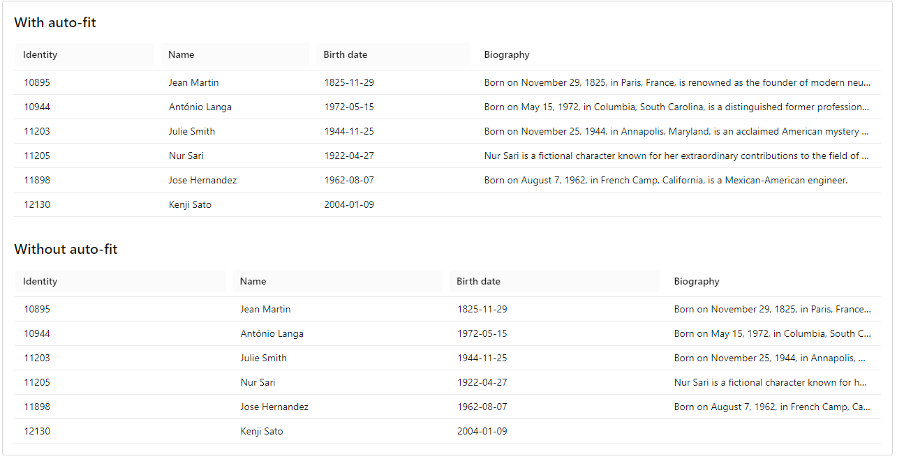
- Add AutoFit feature to size columns automatically as good as possible
- Add parameter to provide labels to resize UI
- Don't use hover effect on header rows
- Fix pagination when using itemprovider
- Fix resizing to initial column widths
- Improve data refresh logic
- Add a new way to render column actions
- Trigger OnRowClick on keyboard enter in DataGrid row (a11y)
There is quite a bit to unpack here, so let's go into some details
AutoFit
This (community contributed!) feature in short uses an algorithm that follows the following pattern:
- Get the available width for the grid
- Loop through the columns and find (flatMap) the biggest width of each cell of the column
- Add up those values to see how much room the cell widths exceed the overall available width
- Calculate the ratio and apply said ratio to each column width while building the grid-template-columns string
In general this works really well, but YMMV. It is an optional behavior and you can decide for yourself if you want to use this or not. One caveat is that this does not work when your grid is using virtualization (as we can't go through all the rows then). See before and after screenshots below to see the difference.

Resizing to initial column widths
When you use Shift+r on a page with multiple DataGrids, the results were not always what you expected. Sometimes all grid columns would reset to just one single configuration.. We have now changed this so the configuration will be restored per grid.
Improve data refresh logic
Another (!) great community contribution improves the data refresh logic in the FluentDataGrid component. It now handles state changes, particularly those related to pagination, much better. It also addresses potential inconsistencies that could occur during rapid state changes or when other events trigger state updates.
Provide new way to render column actions
Inspired by Aspire, I've added a new way to render column actions (sort, resize and options (filter)) by using a menu shown when clicking on a column header:
As can be seen in the image, the current sort direction is displayed on the menu item. The sort direction and filter state are shown on the header with icons.
Which items are displayed on a menu is dependent on the parameters you set on the columns in the grid. When a column is not sortable, its menu won't show the 'Sort' menu item. If there is also no column options/filter specified, it will directly show the Resize UI (in this case because ResizeType.Discrete has been set on the grid):
When a DataGrid is not resizable and a column does not have any options ui (no filter) applied, the header button still functions as a sort button directly:
The 'Bronze' column is not sortable and therefore shows a disabled cursor (not shown in the screengrab)
Inspired by anthor PR mentioned above which makes it possible to supply labels to the grid's UI, there a now records for resize, sort and column options. The records supply default values when a developer does not make any changes.
For now, this new column action behavior is 'opt-in' and can be enabled by adding HeaderCellAsButtonWithMenu="true" (who says naming is hard?) in your data grid component tag. For the next minor release (4.11), I have some more DataGrid changes lined up and this behavior will then become the only way to work with column actions. This is done not just because of code maintenance but also to greatly improve accessibility.
Use double click to quickly select a date in the DatePicker
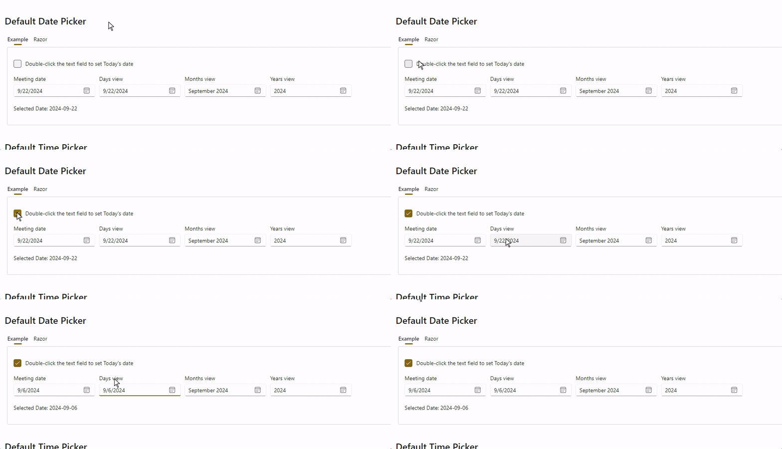
A requirement for a date picker is to be able to quickly select a certain data (for example the current date or the first of the month). With this community contribution we have added just that. You set the DoubleClickToDate parameter to a specific daet and then a double click sets the component to that date.

New FluentMenuProvider
We've updated the FluentMenu component to use the new FluentMenuProvider.
This `FluentMenuProvider is a new component that needs to be placed at the bottom of your layout (like the other Providers). It will then render all menus to this location in the HTML which allows menus to be drawn on top of other components.
You can disable this begavior by adding the UseMenuService="false" parameter to the menu component tag. In that case, a menu will render at the location of where your component tag is placed in the HTML code.
Example
The example below shows both behaviors. When UseMenuService="false", the menu is rendered where it is declared. This can pose encapsulation problems, depending on the container used (in this case, a FluentCard).
The second example uses the FluentMenuProvider to display the menu. In this case, the menu is generated at the end of the HTML page and attached to the button using the Anchor tag. To link the two elements, it's mandatory to use an Id identifier on the clickable element and an identical Anchor value on the menu.
By default, all
FluentMenus will use this new behavior.
Preview packages NuGet feed
Every time a commit is pushed to our dev branch, the core library NuGet package gets published to a special NuGet preview feed.
To consume this preview package in your project, for testing purposes only, you need to add this feed to your project or development environment. An example of how to do this from the CLI is shown below:
dotnet nuget add source --name dotnet8
https://pkgs.dev.azure.com/dnceng/public/_packaging/dotnet8/nuget/v3/index.json
As the feed address shows, our packages are now created in the .NET Core Engineering environment (dnceng). A big step forward for the security, stability and longevity of the library!
The code will add the feed to your nuget.config file. See How to configure NuGet behavior? to learn more.
Alternatively, if you use Visual Studio, you can Install and manage packages in Visual Studio and add the https://pkgs.dev.azure.com/dnceng/public/_packaging/dotnet8/nuget/v3/index.json feed.
This NuGet is a preliminary version and is not intended for production use. It is only intended to be used to test the latest features and bug fixes and provide feedback to us on those.
The official published packages can be found on the public NuGet.org site like usual.
And more...
As mentioned, 30 PRs have been merged into this release. A complete overview can be found on the What’s new page on the documentation site or to the GitHub release page (including links to issues and change requests ).
A special thanks go out to @macel94, @danielpastoor, @RickyLin and @cduluCNB for making their first contributions!
And, of course, we are also grateful for the continued support of all our other contributors.
Comments
Thanks for all your work on FluentUI. My best guess is: N?mes.
MarkGComments are closed