What's new for the Microsoft Fluent UI Blazor components version 3.2.0
Just a short update to highlight what is new, updated, changed and fixed in this minor release of the library.
As usual, first the bullets and then the more complete descriptions:
- New
FluentNavMenu,FluentNavGroupandFluentNavLinkcomponents - Add tooltips to DataGrid columns
FluentCard: AddedAreaRestrictedparameter- New
FluentInputLabelcomponent. - Show error when missing
FluentDialogProvider - Miscellaneous fixes and changes
New NavMenu, NavGroup and NavLink components
The NavMenu component (and it's dependent NavMenuGroup and NavMenuLink components) are using the TreeView and TreeItem components for rendering the menu. This allows for easy expand/collapse functionality but also brings a lot of complexity to the code and needs some work-arounds to get it up-and-running.
For this release we added new FluentNavMenu, FluentNavGroup and FluentNavLink components. These are based on the standard Blazor NavLink component and use it's provided mechanism to determine and select the current route/page (by leveraging an 'active' class). The visual design is 99.9% equal to the previous components but overall performance is much better.
We have replaced the FluentNavMenu component with a new implementation. We've kept the previous TreeView-based component but gave it a new name: FluentNavMenuTree. (we hope this makes it clear which NavMenu does what). We consider the TreeView based component as deprecated now and will remove it in a feature version.
Breaking change
To keep using the previous implementation, a small change is needed in your code: rename FluentNavMenu to FluentNavMenuTree. There are no other changes needed. FluentNavmenuGroup and FluentNavMenuLink remain unchanged.
If you are currently using the TreeView based NavMenu, we strongly advice you to upgrade to the new components. Upgrading is not hard and we've provided a guide in the Upgrade guide in the documentation site.
See the NavMenu page for examples.
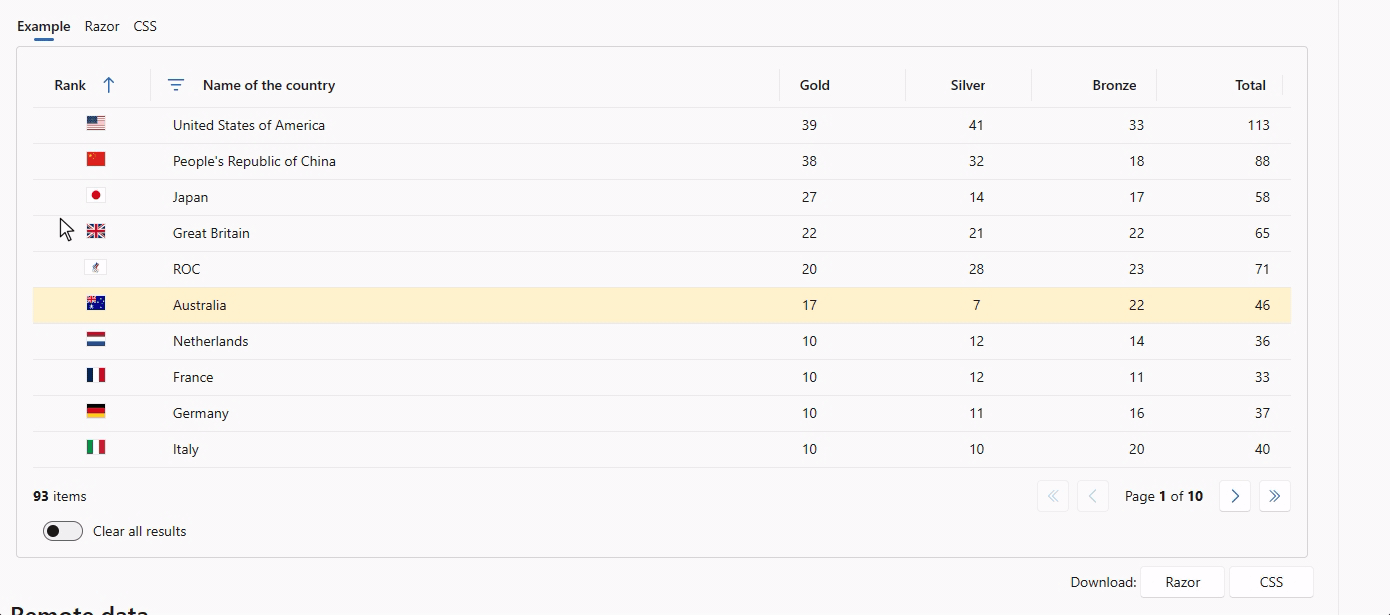
Add tooltips to DataGrid columns
Two new parameters are added for the DataGrid's PropertyColumn and TemplateColumn: Tooltip and TooltipText. Tooltip is a boolean which dertermines to show a (standard) tooltip or not. Setting this to true for a PropertyColumn enables displaying a tooltip for the cell content. By default it will show the same content as shown in the cell. To specify custom content for the tooltip, you can supply a lambda function to the new TooltipText parameter.
Setting the Tooltip value to true does not automatically show a tooltip in case of a TemplateColumn. The cell content in this case is a RenderFragment which does not always translate directly to a text (it could for example show an image or a button). To solve that issue, you need to give a lambda function to TooltipText to define the text to show. This allows for a great deal of freedom in composing the tooltip text regardles of the type of column.
The image shows the following (from left to right):
- Tooltip for the Rank (template) column which combines static and dynamic content in the lambda function
- Standard tooltip for Country (property) column
- Customized tooltip for Gold column which combines static and dynamic content in the lambda function
- Standard tooltip for Silver (property) column
New FluentInputLabel component.
The new FluentInputLabel component is already being used on all input components to display a label in front of the input. It also updates the aria-label attribute of the associated input.
<FluentInputLabel ForId="@Id" Label="@Label" AriaLabel="@AriaLabel">@LabelTemplate</FluentInputLabel>
Labelis the text to be displayed, just above the component.LabelTemplateis the formatted content to be displayed, just above the component.AriaLabelis the text to be used as thearia-labelattribute of the input. Default isLabel
Components updated (no breaking changes if new new properties Label and AriaLabel are empty):
- FluentCheckbox
- FluentDatePicker
- FluentTimePicker
- FluentAutocomplete
- FluentCombobox
- FluentListbox
- FluentSelect
- FluentNumberField
- FluentRadio
- FluentRadioGroup
- FluentSearch
- FluentSlider
- FluentSwitch
- FluentTextArea
- FluentTextField
Examples:
<FluentTextField @bind-value="@MyFirstName" Label="First name" />

<FluentTextField @bind-Value="@MyFirstName">
    <LabelTemplate><h1>First name</h1></LabelTemplate>
</FluentTextField>
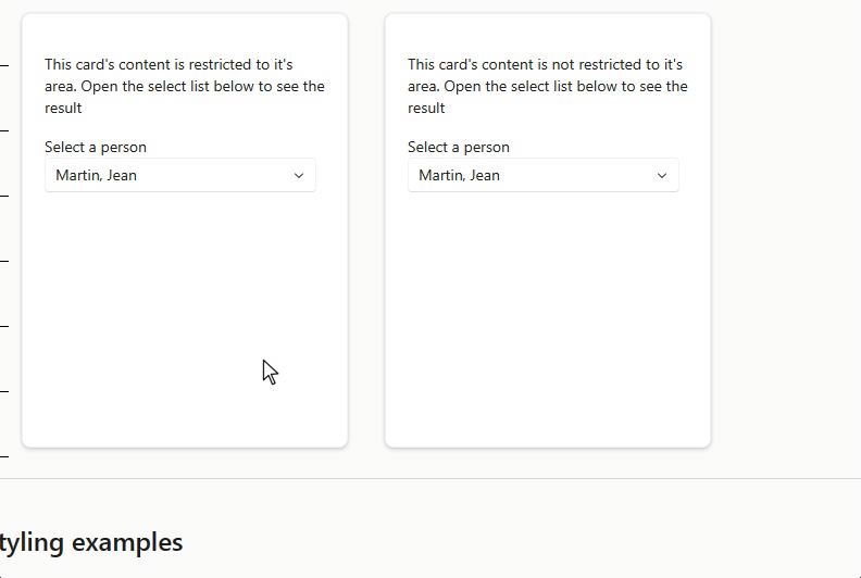
FluentCard: Added AreaRestricted parameter
We've added an AreaRestricted parameter to the Card component which allows you to specify if the content of a card is allowed to break out of the card area or not. To not break any current installations, we choose to disable this behavior by default (as that is the situation now) and you need to explicitly set the parameter to false to get the new behavior. See the image for a side-by-side comparrison (left is default, right is new behavior with AreaRestricted set to false):
Miscellaneous fixes and changes
- Show error when a
FluentDialogProvideris missing from the layout - Fix #796: IconColor doc page
- Fix #797: MessageBar issues
- Fix #805: InlineStyleBuilder on .NET6
- Fix #810: FluentDataGrid error if page is quickly exited
- Fix #815: Manual upload on iOS
- Fix #828: FluentSelect: ValueChanged fired twice
- Fix #801: Remove direct call to Items.Count()
- Fix #834: Chinese abbreviated day name in FluentCalendar
- Fix #836: Setting SelectedOptions does not update FluentSelect
Hope this helps. On to the next!
Comments
Comments are closed