What's new for the Microsoft Fluent UI Blazor components version 3.1.0
We have another great set of new components (Autocomplete, Persona and MessageBar), additions and changes, like improved Dialog handling and customization, and bug fixes ready for you. Read all about it below.
I'm not going to list all the bug fixes in this article but want to point you to the release page for an overview. In this post I focus on the new components and changes and enhancements we have made to the already existing components. First a summary of what's new and changed, then the more thorough descriptions:
New components
The following components have been added:
FluentAutocompleteFluentPersonaFluentMessageBar
Changed/enhanced components
The following components have been changed:
- Dialog
- MenuButton
- DataGrid
- PresenceBadge
- DatePicker & TimePicker
- Menu & Popover
- Button
- Input fields
- NavMenu
- Miscellaneous
Others
- Demo and documentation site changes
- New and updated Icons
Autocomplete & Persona
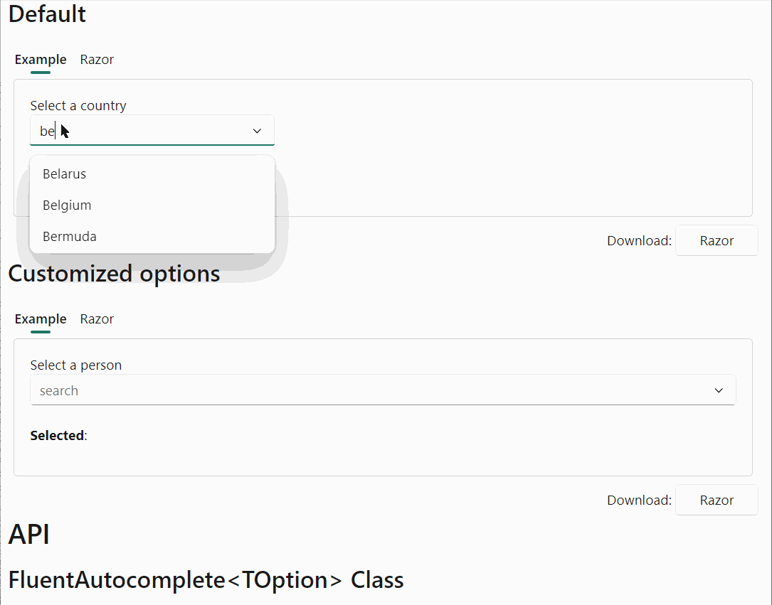
A new component has been added to select (multiple) options from a list.
- The Autocomplete component lets you select multiple options from a list by typing and allows for more complex filtering like 'contains' (intead of just 'starts with' . It displays the selection by using tags and a horizontal scroller (if necessary) as shown in the image:

- By customizing the parameters, and utilizing the (also new) FluentPersona component the Autocomplete can also be used as a 'people picker'. This is also shown in the image above.
See the demo and documentation page for details and examples
MessageBar
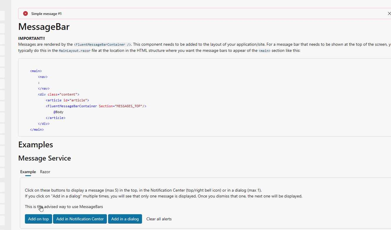
The component formerly known as 'Alert' is now available in the library. To follow the Fluent 2 design, we named it the FluentMessageBar.
- A MessageBar can be used to show messages on top of a page, dialog or card. Every message shown has a specific (out of 5 possible) intent, like a warning. Example:
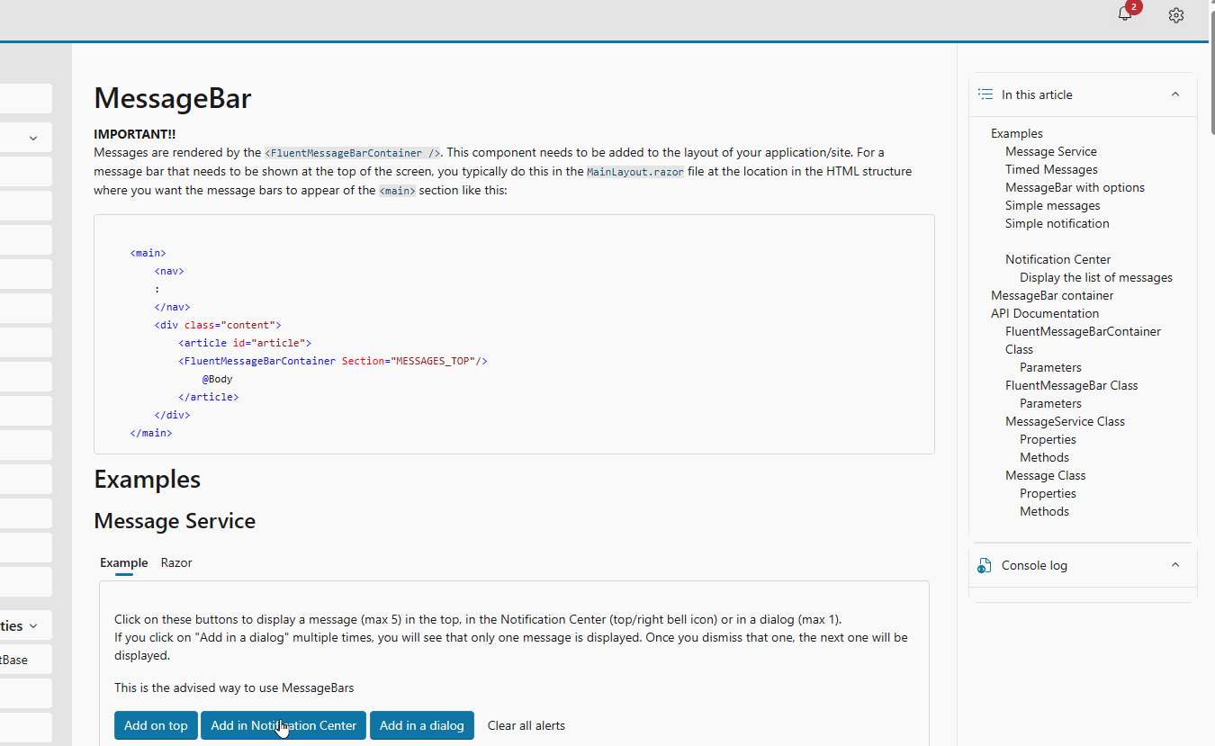
- It can also be used to build a `Notification center' like functionality:
See the demo and documentation page for details and examples
Dialog
You can now customize a Dialog by specifying custom header, footer and/or body components (FluentDialogHeader, FluentDialogFooter, FluentDialogBody).
Example:
@implements IDialogContentComponent<SimplePerson>

@* Header *@
<FluentDialogHeader ShowDismiss="true">
    <FluentStack VerticalAlignment="VerticalAlignment.Center">
        <FluentIcon Value="@(new Icons.Regular.Size24.WindowApps())" />
        <FluentLabel Typo="Typography.PaneHeader">
            @Dialog.Instance.Parameters.Title
        </FluentLabel>
    </FluentStack>
</FluentDialogHeader>

@* Footer *@
<FluentDialogFooter>
    <FluentButton Appearance="Appearance.Accent" OnClick="@SaveAsync">Close</FluentButton>
</FluentDialogFooter>

@* Body *@
<FluentDialogBody>
    <FluentTextField @bind-Value="@Content.Firstname">FirstName:</FluentTextField>
    <FluentNumberField @bind-Value="@Content.Age">Age:</FluentNumberField>
</FluentDialogBody>
This will render as 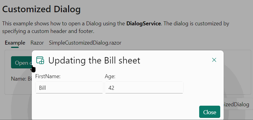
A Dialog will render with default header and footer content. Following the example above, it is now possible to replace these by customized content. You can now also configure to not render a header and or footer at all by adding them to a dialog definition with a Visible=false property. The header has a ShowDissmiss property, which displays and manages the dismiss icon in the top right-hand corner (or top left-hand when using RTL).
Once customized, the developer must manually manage the close buttons (Save, Cancel, OK, ...) using code similar to this:
[CascadingParameter]
public FluentDialog Dialog { get; set; } = default!;

private async Task SaveAsync()
{
    await Dialog.CloseAsync();
}
Obsoleted methods
Some of the dialog box methods have been flagged as Obsolete to give preference to one of the following two methods.
ShowDialogAsync<TDialog>(object data, DialogParameters parameters)to send data to the dialog box.ShowDialogAsync<TDialog>(DialogParameters parameters)to open the dialog, without sending data.
(similar methods for displaying a right/left panel or for displaying a SpashScreen).
Other changes
- All
Show...Asyncmethods in theDialogServicenow return anIDialogReference. - A Panel now sizes to the
Widthspecified in the parameters.
See the demo and documentation page for details and examples
MenuButton
- We added
ButtonStyleandMenuStyleparameters to allow to change the style for these two parts independently.
See the demo and documentation page for details and examples
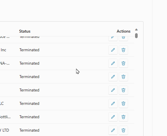
DataGrid
- We've added an
EmptyContentparameter which you can use to display information when there is no data to show. Two examples: - Sticky header is now always on top. Before, any buttons would scroll over the header.
- When the item size is set (when using
Virtualize), the content will now be vertically centered in the row.
See the demo and documentation page for details and examples
PresenceBadge
- The status badge has been updated to be Fluent 2 compliant.

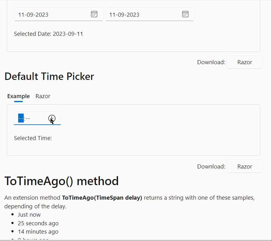
DatePicker & TimePicker
- The DatePicker and TimePicker popup area will now be dynamically positioned below or above the component, depending on the available space.
See the demo and documentation page for details and examples
Menu & Popover
- We enhanced the functionality to close or hide a menu or a popup automatically when clicked outside of it (using the Overlay component).
Button
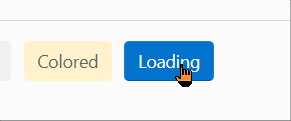
- When using
IconStartorIconEndandLoadingtogether, the progress ring now replaces the icon (start or end, not both).
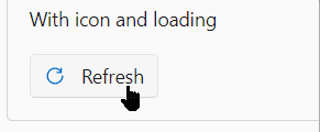
Without an icon, the way the Loading parameter works remains unchanged.
See the demo and documentation page for details and examples
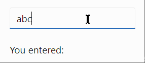
Input fields
- By using the new
ImmediateandImmediateDelayproperties you can now logically use both the@onchangeand@oninputattributes (at the same time!) for the following components:- FluentNumberField
- FluentTextField
- FluentSearch
- FluentTextArea
Example
<FluentTextField @bind-Value="value1" Immediate="true" ImmediateDelay="500" />
<p>You entered: @value1</p>
NavMenu
- When using routes with more than one segment or using routes that contain the name of another route, the NavMenu would always highlight the first/shortest route found. For example if the menu contains these hrefs:
//container/containers
And then someone navigates to /containers. The current code would match on, and select, /container. This has been corrected.
Miscellaneous
- A couple of more colors have been added to the
OfficeColorsenumeration. - All dialog variants (Dialog, MessageBox, Panel and SplashScreen) and the Overlay now support a
PreventScrollparameter that makes the the body content shown behind the component not scrollable.
Demo and documentation site changes
We try to keep improving the demo and documentation site. Things we change or add are not tied to a specific release or version and can usually be seen as soon as they are done on the preview site. Changes to the documentation are visible on the 'regular' site immediately.
Some enhancements we made:
- Added 'Notification Center'
Combining the new FluentMessageBar component with the existing Panel dialog allows for creating a notification center like you can find in the Azure portal. We implemented this in the demo site and you can take a look at the available source code as an example of how such functionality could be realized. - Added 'Site settings'
We've moved the setting for color, theme and direction to it's own panel. In a future update we would like to make these settings persistent. - The
DemoSectioncomponent has been extended to have aMaxHeightparameter.
See the https://www.fluentui-blazor.net/Dialog page on the 'Razor' tabs for an example. Let us know if you would like to see this set to a good default value for all the demo sections. - The API documentation is now better readable on mobile devices. We added a scroll option:
New and updated Icons
We've updated the library to the Fluent UI System Icons 1.1.217 release.
What's new (Name / Size(s) / Variant(s))
- Chevron Down / 32 / Filled & Regular
- Chevron Left / 32 / Filled & Regular
- Chevron Right / 32 / Filled & Regular
- Chevron Up / 32 / Filled & Regular
- Document Lightning / 16, 20, 24, 28, 32, 48 / Filled & Regular
- Edit / 12 / Filled & Regular
- Server Link / 16, 20 / Filled & Regular
- Step / 20, 24 / Filled & Regular
- Tab Desktop Multiple Add / 20 / Filled & Regular
- Text Description / 16, 28, 32 / Filled & Regular
- Text Grammar Lightning / 16, 20, 24, 28, 32 / Filled & Regular
What's updated (Name / Size(s) / Variant(s))
- Edit / 16 / Filled & Regular
- Server Link / 24 / Filled & Regular
We are receiving more and more engagement at our GitHub repository, Gitter and Discord. If you are already a bit more experienced user of the library, please help us by answering questions, offer guidance, etc. Let's do this together!
Hope this helps. Onwards to the next release!
Comments
Comments are closed