What's new for the Microsoft Fluent UI Blazor library 4.14
Although we are now fully focused on delivering you a great v5 version of the library in the near future, we did manage to get an update for v4 out the door. This includes one highly demanded feature that warranted the jump to a new minor by itself.
That feature we've added is the possibility to use hierarchical data in the DataGrid (we are way past just adding a row click event ??)! I'll tell a bit more about that below.
Other notable things we did in this release are:
- The usual document and demo site updates
- Update the icons library to the latest Fluent UI System Icons release (1.1.318)
- Fix 3 other DataGrid issues
- Update, extend and fix issues in 5 other components
The complete overview can be seen on the site at the What's New page
But what about 4.12 and 4.13?
Yeah, sorry about that. We did have add some very nice additions and new capabilities in those versions as well. I was too busy however with starting a new job (outside of Microsoft) and working on the v5 version that writing these release Blog posts fell too far down (or actually off) the ToDo-list.
Now, I won't go into too much detail on the changes in those versions here, but I'll provide a short summary. For the full details see the page I linked to in the previous section.
Highlights
- Added support for .NET 10 (both in offering a compiled version in our package as well as full template support)
- DataGrid enhancements for async loading, for the SelectColumn and a full column resize handle

- Menu fixes for dispose errors
- AutoComplete: new feature and overrides
- Dialog: Return focus to initiator when dialog is closed and offer a way to specify header typography
- And much more...
In total 34 components have seen changes,fixes and or enhancements in these 2 minor version releases. Important to re-iterate again: not all changes were made by us. We say a heartfelt "thank you!" to a (still growing) group of contributors.
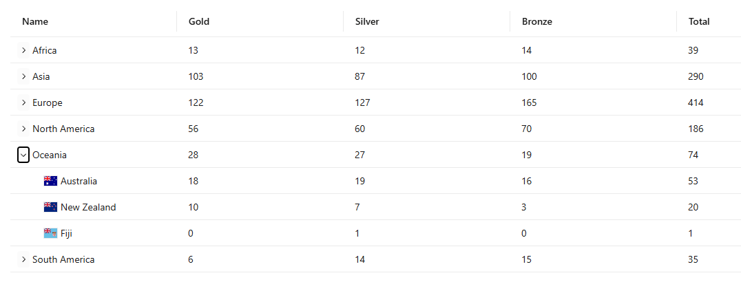
The hierarchical DataGrid
The Aspire team has had expendable/collapsible rows in their Resources page in the Dashboard for a while already. It was however a custom coded implementation that was geared specifically towards being used in Aspire. With some help from my Copilot friends, Claude and Gemini, I was able to provide a generic solution that can work for and with any type of row data, as long as both the parent and the child rows have the same properties (i.e. show the same columns).
The functionality is powered by the IHierarchicalGridItem interface, which allows developers to transform a flat list of data into a navigable tree structure within the grid.
How IHierarchicalGridItem Works
The IHierarchicalGridItem interface acts as a contract for your data model, providing the metadata necessary for the grid to manage parent-child relationships and display states. It includes four key properties:
- Depth: Defines the level of an item (starting at 0 for root items).
- HasChildren: A boolean that tells the grid whether to render an expand/collapse toggle for that specific row.
- IsCollapsed: Manages the visibility state of the item's descendants.
- IsHidden: Indicates if the row should be rendered at all (e.g., when a parent higher up the tree is collapsed).
Enabling Hierarchy in FluentDataGrid
To implement hierarchical data, a TGridItem must implement this interface. The FluentDataGrid then uses this metadata to automate the complex parts of tree-view rendering:
- Visual Indentation: The grid automatically calculates and applies margin-inline-start based on the Depth property, ensuring clear visual separation between levels.
- State Management: When a user clicks the expand/collapse button, the grid invokes
ToggleExpandedAsync(TGridItem). This internal method flips theIsCollapsedstate and triggers a data refresh. - Flat-to-Hierarchical UI: While the underlying
ItemsorItemsProviderusually provides a flattened list of items, the grid uses the interface properties to decide which rows to show and how to style them. - Custom Logic: The
OnToggleevent callback allows you to perform additional actions, such as lazy-loading child items from a database only when a node is expanded.
By leveraging IHierarchicalGridItem, you can build sophisticated, performant tree-grids that maintain the same familiar API as the standard FluentDataGrid.
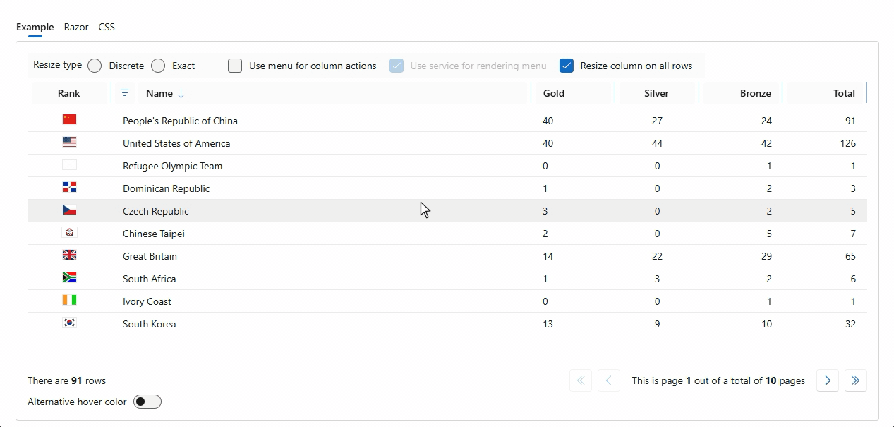
Both 2-level and multi-level examples have been added to the demo site. See the DataGrid - Hierarchical data page. And yes, the hierarchical functionality works together with the resize functionality perfectly well.
What's next
We are currently focusing almost exclusively on getting the v5 version ready. There are only a few components left that we want to tackle before the final release. I think we will have a near feature complete release candidate in the coming weeks. In the mean time, check out the v5 demo site to see how far we are already. Trust me, you won't be disappointed by the speed and quality of these new components!
Comments
Be the first to post a comment