What's new for the Microsoft Fluent UI Blazor components version 4.3.0
A New Year, a new release! This year we are not going to magically solve all your UI problem. We have however, added a new Wizard component to help you breaking down complex user interface tasks in an easy to use set of steps. Besides this new component, we made quite a few fixes. Bboth in the library and in the demo and documentation site. The menu structure has been overhauled and overview pages have been added. As always, first the highlights and then the extended descriptions.
- New Wizard component
- New PageScript component
- Progress and ProgressRing updates
- Templates updates
- Documentation and demo site updates
- Miscellaneous fixes and changes
Wizard component
A wizard presents a series of steps or conditions that the user needs to complete in order to accomplish a goal. By splitting up a complex task into a sequence of chunks, you can effectively simplify the task.
By default, steps are displayed on the left (right when using RTL mode) of the wizard, but they can be moved to the top of the component. The steps are displayed in the form of circles (like notification badges). A check mark is shown once the step has been processed. Steps can be numbered, by using the DisplayStepNumber parameter. The steps can also be customized via the IconPrevious, IconCurrent and IconNext parameters. The order of the steps is defined when designing/building the wizard. It is possible to enable or disable steps through the Disabled parameter.
The Label and Summary parameters display a name and description for each step (either below or next to it). The StepTitleHiddenWhen property hides this information based on the available screen size. By default, it is hidden on cell phones (width is less than 600px).
Steps and navigation buttons, are fully customizable using the the StepTemplate and ButtonTemplate parameters. An example of this is available at the demo site. Button labels can be customized using the ButtonTemplate parameter or by modifying the FluentWizard.LabelButtonPrevious / LabelButtonNext / LabelButtonDone parameters.

PageScript component
In a Blazor Web App with static server-side rendering (static SSR) and/or enhanced navigation, some steps are needed to load JavaScript. An article on how to do this is published on the Microsoft Learn site.
The article explains how some applications depend on JavaScript to perform initialization tasks specific to each page. When using Blazor’s enhanced navigation feature, which allows the user to avoid reloading the entire page, the page-specific JavaScript may not be executed again as expected each time an enhanced page navigation occurs.
To avoid this problem, the article proposes to use a PageScript component. We have added this component to the library (and are using it for example within the templates in the NavMenu in a SSR situation). The component can be used like this:
<PageScript Src="./Components/Pages/PageWithScript.razor.js" />
In your Blazor Web application, add the collocated JS file:
onLoadis called when the script is added to the page.onUpdateis called when the script still exists on the page after an enhanced update.onDisposeis called when the script is removed from the page after an enhanced update.
/* Components/Pages/PageWithScript.razor.js */

export function onLoad() {
  console.log('Loaded');
}

export function onUpdate() {
  console.log('Updated');
}

export function onDispose() {
  console.log('Disposed');
}
Progress and ProgressRing updates
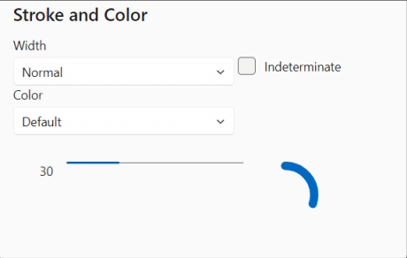
We have added two new parameters to the FluentProgress and FluentProgressRing components: Stroke and Color
- Stroke: Allows you to to change the stroke width of the progress bar/ring (possible options are
Small,NormalorLarge). - Color: The color ( to be used for the progress bar/ring. If not set, the default theme color is used.
Templates updates
Numerous fixes have been made to the Web App template to ensure pages and layouts apply the right @rendermode attribute and NavMenu options. This depends of course on the choices made for the interactivity mode when creating an application from the Web App template. By leveraging the PageScript functionality described earlier, the NavMenu can has full functionality (including collapse expand) in SSR mode as well!
Install the templates for CLI and Visual Studio so you can start new applications with everything needed for Fluent already set up.
Documentation and demo site updates
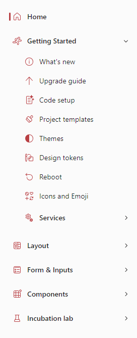
We've shuffled the docs and made a new content structure. We also added overview pages to a couple of sections an hope this makes the information and examples better discoverable.
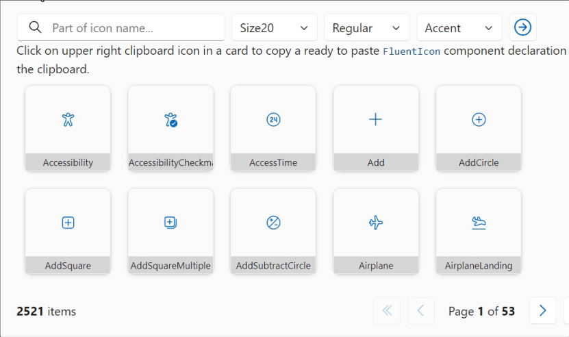
Not all icons are available in all sizes. This sometimes made it hard to find the right icon for the job. With the improved Icons Explorer you can now search through all sizes in one go. A small indicator of its size will be displayed in each result. As always, you can copy a found result to the clipboard in a ready-to-paste format.
Miscellaneous fixes and changes
The list of fixes and changes for this release is quite long. We refer you to the What's New page on the docs site for the complete overview.
Comments
Comments are closed