What's new for the Microsoft Fluent UI Blazor library 4.9
Okay, I did not expect us to publish another new version before the summer holiday, but yet here we are. The amount of changes, additions, enhancements and fixes was too big to leave it lying around till later. Read on to find out about the most prominent highlights of this release. And enjoy the summer. I know I will!
- New Rating component
- DataGrid enhancements
- CssBuilder- Add
ValidateClassNamesconfiguration - Select component - Better
PlaceHoldersupport - DialogService - Add
UpdateDialogAsyncto refresh parameters and content while dialog is on screen - And more...
New Rating component
We’ve added a new FluentRating component that lets users assign a rating to a particular element. By default, the rating can be set to between 0 and 5 stars, but both the values and icon used can be customized. The current version does not support 0.5 increments/decrements yet.
This component is made accessible by adding the option to use the arrow keys to increase (→/↑) or decrease (←/↓) the value. Pressing Shift + {arrow} sets the value to either 0 or the configured maximum.
The component is derived from our base input component and can be bound and used in forms
Example code
<FluentRating Max="10" Value="2" Label="Test" />

DataGrid
We've made some significant changes in the DataGrid (and related components). In short:
- Better WCAG 2.2 support - one-click column resizing
- Added
OnCellClickandSelectColumn.SelectFromEntireRow - Have Display attribute in enumerations shown in column values
Better WCAG 2.2 support - One-click column resizing.
To better comply with the accessibility WCAG 2.2 standard, we’ve added 2 ways to resize columns with a single click in addition to dragging the resize bar in the header. We are using the already available column options facility for displaying the user interface for this.
To enable this new functionality, a new ResizeType parameter has been added to the FluentDataGrid. You set its value to either DataGridResizeType.Discrete to resize the column the option is shown for in steps of -10 or +10 pixels as shown in the image below or DataGridResizeType.Exact to resize the column the option is shown for to the pixel value typed in.
If the parameter is not supplied, the resize options will not be shown. Obviously, the Resize parameter needs to be set to true for this as well. Both options also present a 'reset' option to go back to the orgiginal column sizes.
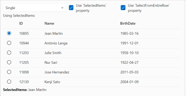
Add SelectFromEntireRow and OnCellClick
In response to user requests, we’ve added a SelectFromEntireRow parameter to the SelectColumn. Setting its value to false the user can not click anywhere on the grid row to select it, but only the radio button or check box can be used for that.
The default value for this new parameter is set to true maintain the existing current behavior.
We’ve also added an OnCellClick event to capture clicking on a specific cell.
Example code (simplified)
<FluentDataGrid Items="@People" TGridItem="Person">
    <SelectColumn TGridItem="Person"
                  SelectMode="..."
                  SelectFromEntireRow="@SelectFromEntireRow"
                  @bind-SelectedItems="@SelectedItems" />
    <PropertyColumn Width="100px" Property="@(p => p.PersonId)" />
    <PropertyColumn Width="300px" Property="@(p => p.Name)" />
    <PropertyColumn Width="150px" Property="@(p => p.BirthDate)" />
</FluentDataGrid>
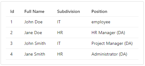
Have Display attribute in enumerations shown in column values
When a PropertyColumn column in a DataGrid defines an expression, it always returns a string value. In the case of the value being an enumeration, it simply returns the string representation of that value. By using a DisplayAttribute, it is now possible to define a user-friendly name for this value.
Example code
public enum Positions
{
    employee,

    [Display(Name = "HR Manager (DA)")]
    HRManager,

    [Display(Name = "Project Manager (DA)")]
    ProjectManager,

    [Display(Name = "Administrator (DA)")]
    Administrator
}
CssBuilder - Add a ValidateClassNames configuration option.
All styles used by the Fluent UI Blazor library are included in the package. You don’t need to do anything to include these in your project.
Of course you can always add your own styles too by using the Class and/or Style parameters on components. By default, classes are organized and verified by the component itself (specifically by checking that class names are valid).
Some frameworks, such as Tailwind, add class names which are invalidated by our verification process. For example, in Tailwind you'll see square brackets in class names , like min-h-[16px] or bg-[#ff0000]. We had some discussions on the repository whether such names are valid and/or following standards or not. Regardless of that, we do not want to break integration with Tailwind or other frameworks, so we have put an option in place to disable class name validation. This can be done by adding following code to the library service configuration in your Program.cs file:
Example code
builder.Services.AddFluentUIComponents(options =>
{
    options.ValidateClassNames = false;
});
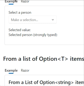
Select component - Better PlaceHolder support.
The FluentSelect component can now correctly display a placeholder text. Initially a parameter for this was not present for this component. As a 'workaround' you can now add a 'fake' first option. This option will be displayed only when the user opens the component for the first time. The option disappears when the user selects another option for the list shown and will not be presented in the list on subsequent views.
Example code
<FluentSelect TOption="Person"
              Label="Select a person"
              Placeholder="Make a selection..."
              ... />
DialogService - Add UpdateDialogAsync to refresh parameters and content while dialog is on screen
The UpdateDialogAsync method is added to the DialogService to enable updating all dialog box data (Parameters and Content) while the dialog is being shown.
Example code (simplified)
var dialog = await dialogService.ShowDialogAsync<TestDialogHeaderFooter>(myUser, parameters);

parameters.Title = "My new title";
parameters.PrimaryAction = "Oh yes";
parameters.Content = new() { Id = 2, Name = "Denis" };

await dialogService.UpdateDialogAsync(dialog.Id, parameters);
NuGet package preview feed
Every time a commit is pushed to our dev branch, the main library NuGet package gets published on a special NuGet preview feed.
To consume this package in your project (for testing purposes only), you need to add tghis feed to your project or development environment. An example of how to do this from the CLI is shown below:
dotnet nuget add source --name dotnet8 https://pkgs.dev.azure.com/dnceng/public/_packaging/dotnet8/nuget/v3/index.json
As the feed address shows, our packages are now created in the .NET Core Engineering environment (dnceng). A big step forward for the security, stability and longevity of the library!
The code will add the feed to your nuget.config file. See How to configure NuGet behavior? to learn more.
Alternatively, if you use Visual Studio, you can Install and manage packages in Visual Studio and add the https://pkgs.dev.azure.com/dnceng/public/_packaging/dotnet8/nuget/v3/index.json feed.
?? This NuGet is a preliminary version and is not intended for production use. It is intended to be used to test the latest features and bug fixes.
If you only want the use the official published packages, you can find these on the public NuGet.org site.
And more...
Well, quite a few PR's have been merged in in this version again. Please see the What’s new page on the documentation site or to the GitHub release page for a complete overview (including links to issues and change requests on GitHub).
A special thanks go out to @mobinseven, @Christo262 and @franklupo (Daniele Corsini, did most of the work on the Rating component) for their first contributions!
And, of course, we are also grateful for the continued support of all other contributors.
Comments
Comments are closed